Design Tabloid

Design Tabloid

Design Tabloid featuring great design, architecture, fashion, graphics and innovation from across the globe.


Fck 2020

What is the purpose of the design? Be functional, beautiful, comfortable, stimulating. And, at times, liberating. Fck 2020 is a self-promotional calendar that celebrates the arrival of 2021 by making fun of the damned 2020. Twelve months of colors, dreams, big and small desires enclosed in a limited edition design object. After a 2020 full of “less”, Fck 2020 Calendar it's a wish for a 2021 full of “more”, a talisman, an invitation to turn the page with a smile.

Continue reading


Cut and Paste

This project toolkit, Cut and Paste: Preventing Visual Plagiarism, addresses a topic that can affect everyone in the design industry and yet visual plagiarism is a topic that is seldom discussed. This could be due to the ambiguity between taking reference from an image and copying from it. Therefore, what this project proposes is to bring awareness to the grey areas surrounding visual plagiarism and position this at the forefront of conversations around creativity.

Continue reading


Madame Butterfly

The idea of the designer behind the opera posters was to create an iconic portrait of a singing/shouting woman, the main figure in opera plot, as a symbol of uncontrolled passion. The goal was to show the tragic and dependent role of a woman in libretto of such operas as Madame Butterfly, Tosca or Norma in the form of iconic and expressive interpretation. On all posters the composition represents the final scene - culmination moment of the opera story. Designer was inspired by the suprimatic posters of Kazimir Malevich and by the painting of Edvard Munch "The Scream".

Continue reading


Designers Brasileiros

The brand of the website Designers Brasileiros consists of a panel in the shape of the letter D composed by geometric pieces that fit together and represent the design specialties. These pieces are shapes extracted from the Brazilian flag and also form the letter B and a toucan. The toucan was defined by the fact that it is one of the largest seed dispersers of Brazilian fauna and one of those responsible for the formation of tropical forests. Thus, for the brand, the dispersion of seeds by the toucan conceptually symbolizes the dissemination of knowledge that is the purpose of the website.

Continue reading


Who's That Eating

This interactive pop-up book follows seven animals enjoying their favorite snacks, each with a 3D pop up fold showcasing their distinct eating style. Each pop up was designed with a single page cut out, and a second backing page revealing the inside of each mouth and adding structural integrity. This simple design, combined with paper collage illustrations, brings life to each animal. The text includes eating sounds via Japanese onomatopoeia, encouraging the reader to open and close the pages as the animals munch away.

Continue reading


Woonwaard

Woonwaard is one of the largest housing corporations in the Netherlands with a large number of social rental homes. Our DNA program showed that the new identity had to be modern, yet serious, and radiate peace and serenity. The identity also had to represent the diversity and inclusiveness of the tenants and the positive aspects of renting. The designers also wanted the organization's passion to shine. The result is a unique colorful identity system, which plays an important role for the diversity and inclusiveness of its tenants.

Continue reading


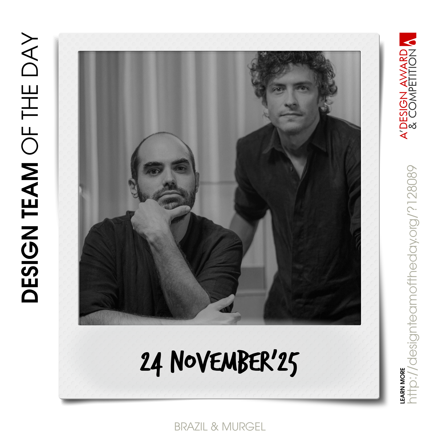
World's greatest design teams.

Sometimes you need a very big team of talented designers to come up with truly great designs. Everyday, we feature a distinct award-winning innovative and creative design team. Explore and discover original and creative architecture, good design, fashion, graphics design and design strategy projects from design teams worldwide. Get inspired by the original works by grand master designers.

Continue reading